This semester in my Strategic Design and Innovation Fellows class, BMGT458A, three creative professionals came and spoke with us about their work at the design agency, Pearfisher. I was especially fascinated with their partnership with McDonald’s, my personal favorite spot for fries and my family's go-to road trip pit stop.
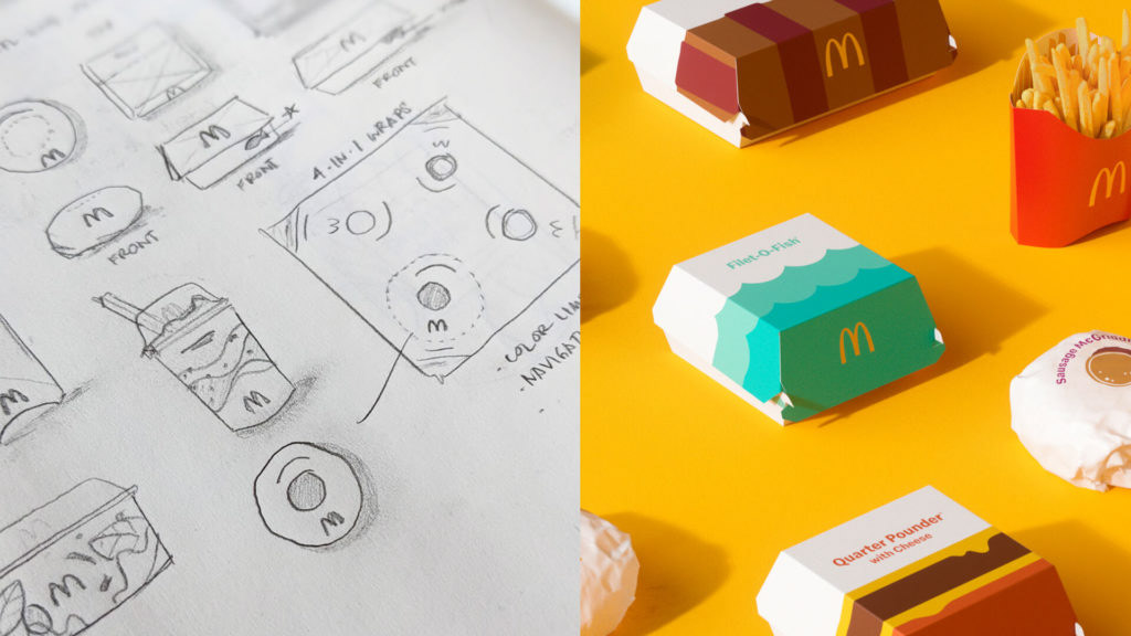
How do you approach redesigning the packaging of a global icon? Matt Sia, Courtney Tight, and Talia Evans faced that challenging task. McDonald's has had a significant presence in our modern cultural landscape with packaging design that can be recognized a mile away. But every icon needs to keep evolving and finding ways to remain fresh and relevant that continues to create moments of joy for customers everywhere.
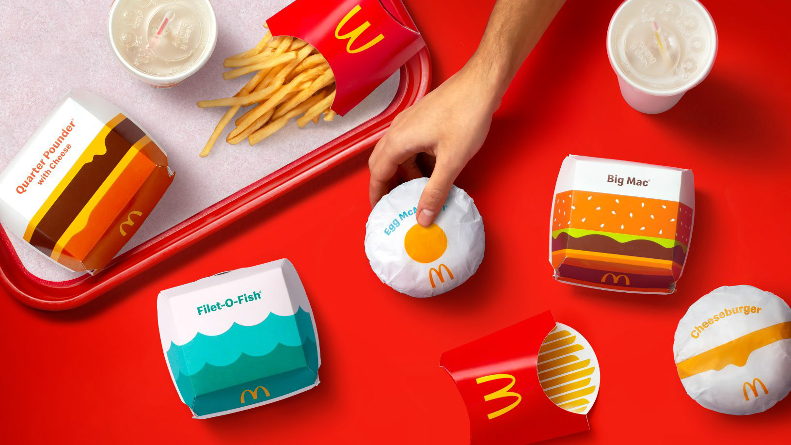
To modernize the packaging experience, and ultimately modernize the brand's broader restaurant experience, Pearlfisher aimed to move the packaging toward a simple, iconic, fresh and playful design. Essentially, the new packaging design was to say more with less. One of the challenges was creating designs that could translate across cultures. Therefore, they created simple, playful illustrations for each item to connect customers to their food in a fun, observable way. No matter the region or language, the packaging design simply inspires moments of joy through a universal visual language for people around the world.
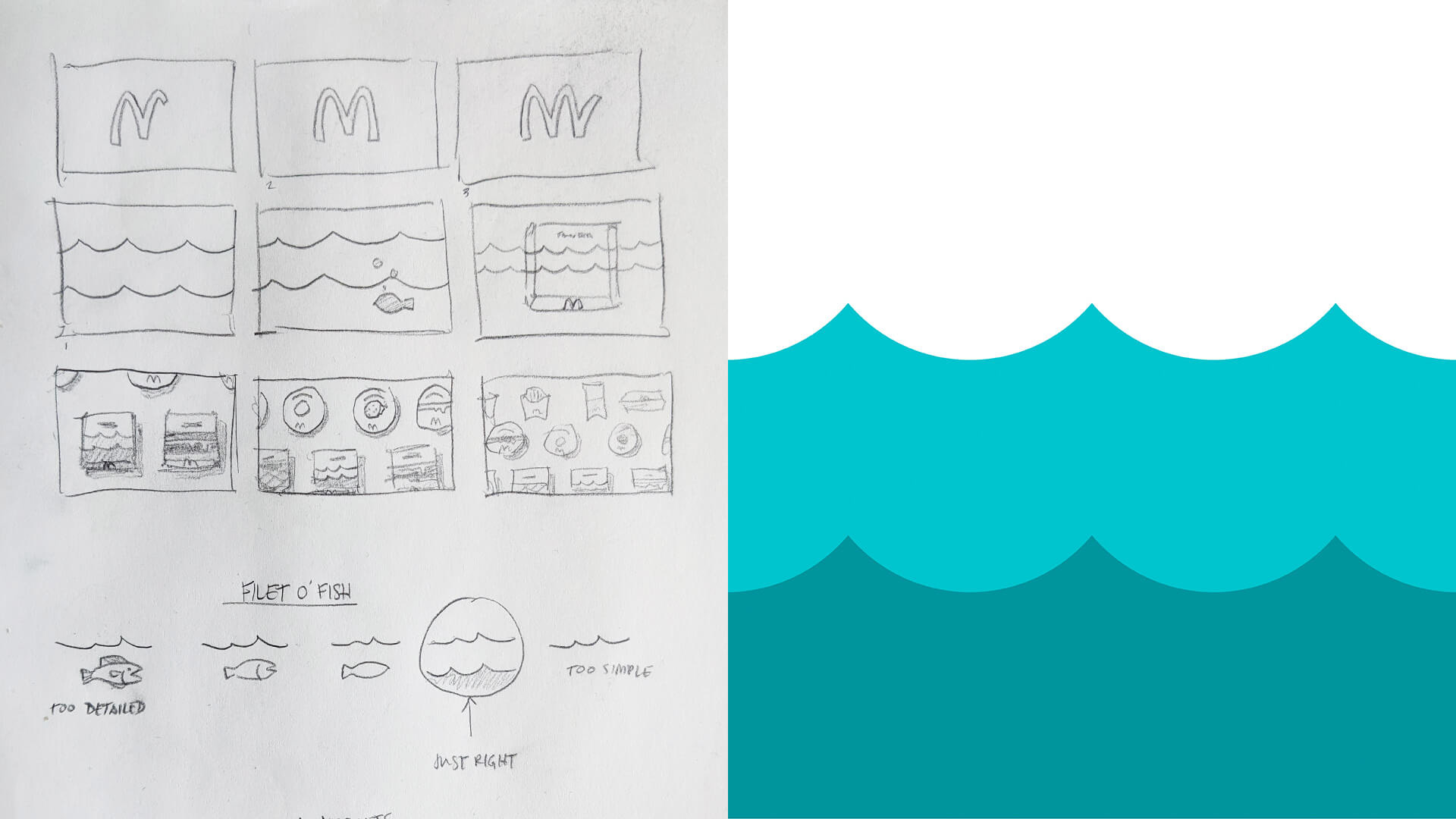
My personal favorite of the redesigns is the Egg McMuffin. The design could communicate the essence of a single item with the purest illustration. A bright yellow egg yolk surrounded by white space on the wrapper.
